
Taikun · Product Design · UX/UI · Design Systems
Designing clarity for complex cloud infrastructure.
Making room for data, adapting navigation to context, and building consistent interaction patterns for a cloud management platform.
The challenge
Taikun is a cloud management platform for Kubernetes environments and virtual infrastructure. Its interface is primarily about configuring resources and working with technical data. As the product expanded, inconsistent navigation, components, and action placement made the experience harder to follow.
As the sole designer, I worked from high-level requirements discussed with the CEO and collaborated with front-end developers and DevOps specialists to improve existing functionality and design new features.
Designing around the data
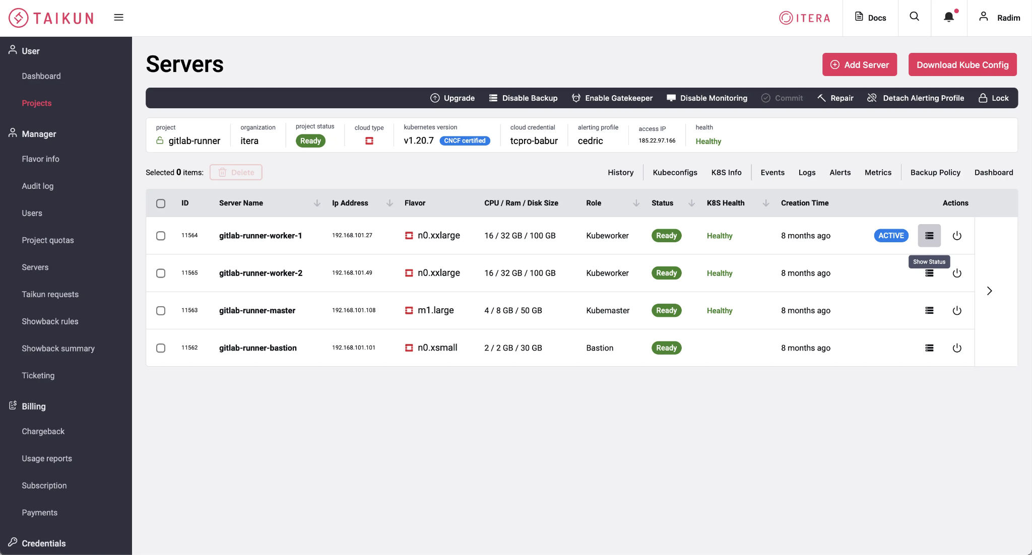
The original interface included a full-width top bar, approximately 64 pixels high, containing global utilities. I questioned whether these controls needed to occupy the entire width of a data-first application.
Global search and notifications can be useful throughout the day, but they do not need to compete continuously with infrastructure data. Documentation, help, theme settings, and account actions are generally less central to the current task. I moved these controls into a persistent, narrow utility rail on the right, preserving access while giving the workspace more room.
Taikun was an English-language, left-to-right interface, primarily intended for work on landscape-oriented screens. This informed a clear spatial hierarchy: primary navigation on the left, data in the center, and global utilities on the right. Placing the utility rail on the left would have pushed both navigation and data further away from the user's initial point of attention.
Before — historical interface
Navigation that adapts to context
The primary navigation is the main entry point to the product. But as users move deeper into a project, their focus shifts from finding a section to working with specific infrastructure resources.
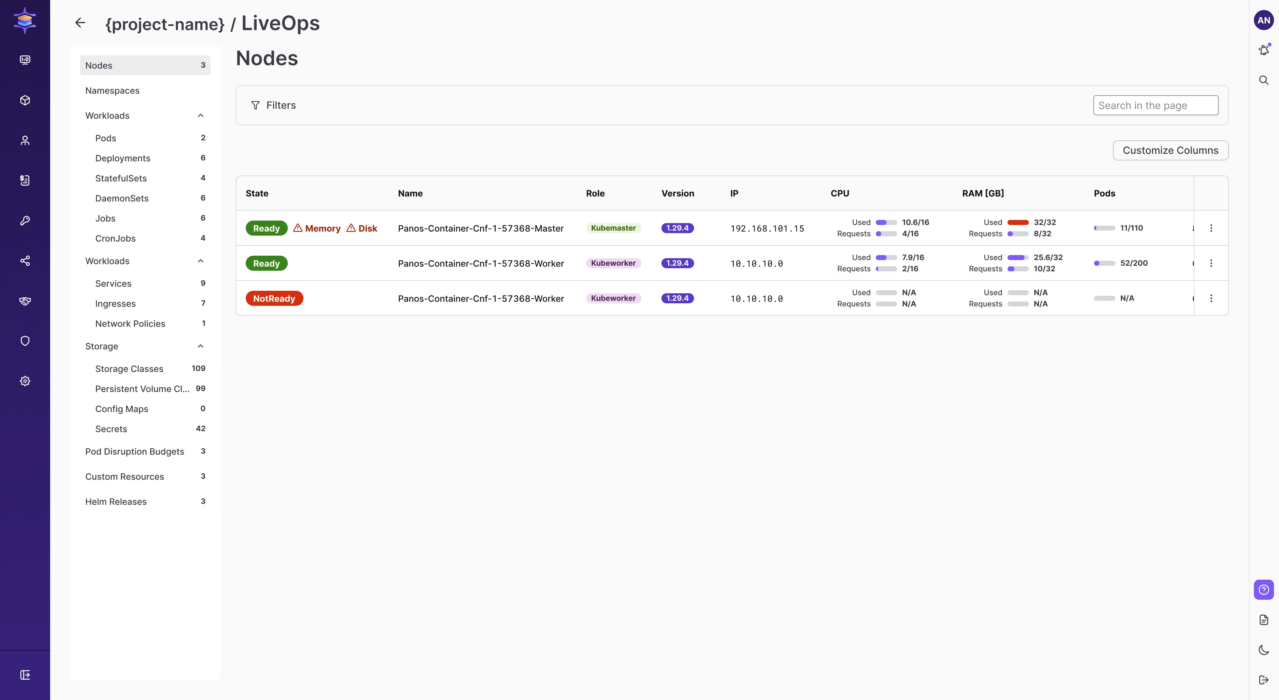
At deeper levels, the primary navigation automatically collapses into an icon-only rail to make space for contextual inner navigation and more detailed data. The main sections remain accessible through their icons, and users can manually expand the navigation whenever they need to. The interface adapts to the task without taking control away from the user.
In the Kubernetes view, users can move from Project Detail into K8s Information / LiveOps. There, inner navigation provides access to resources such as Nodes, Pods, Deployments, and StatefulSets, while the central area stays dedicated to filters, resource information, and tables. Global utilities remain available on the far right.
Rethinking the project workspace
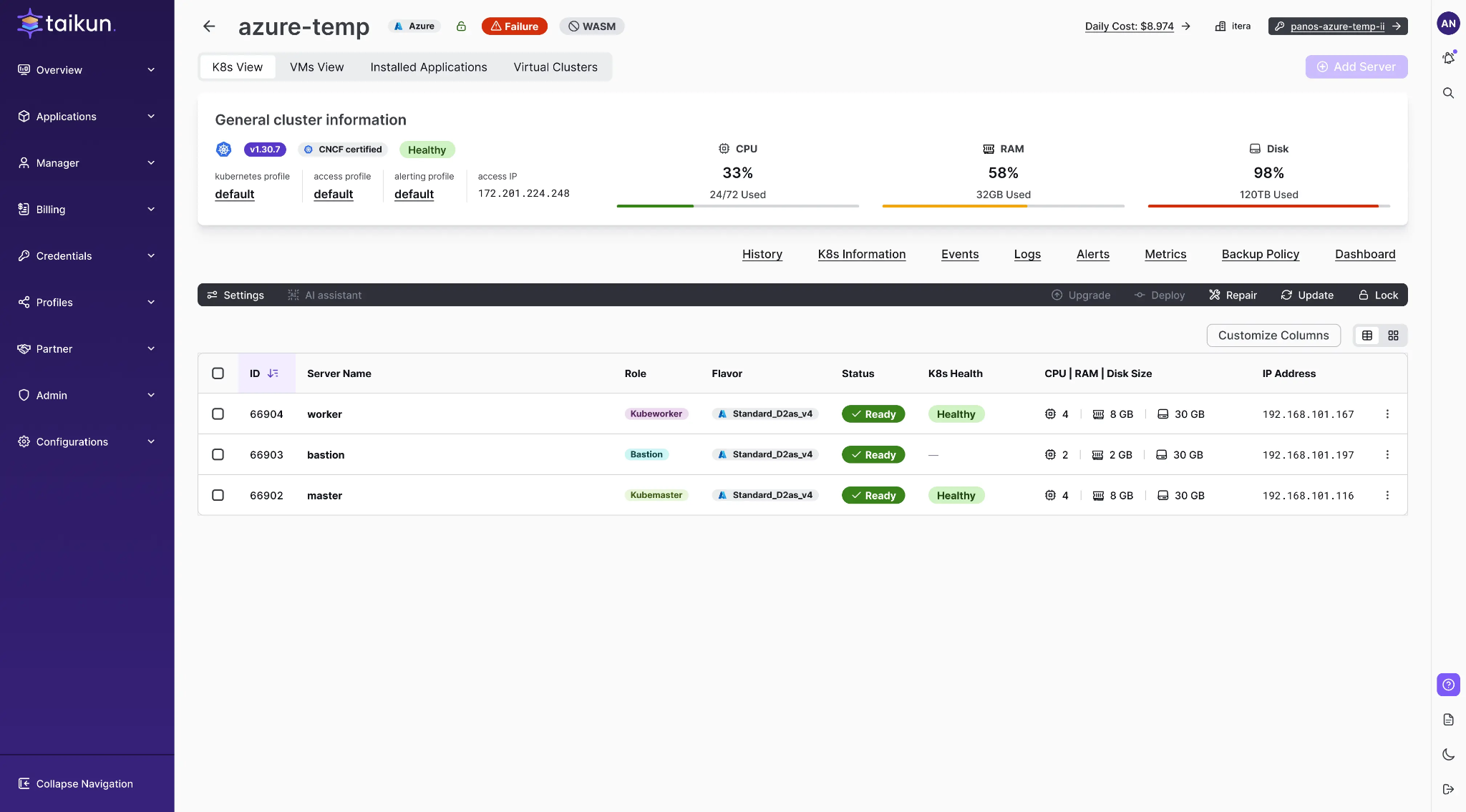
The same hierarchy informed the Project Detail redesign. I separated information that should remain visible from navigation and actions that depend on the selected infrastructure view.
Persistent project context
Project name, cloud provider, status, and other key details remain visible while switching between views.
View-specific navigation
Kubernetes and VM views share a common structure while exposing the secondary navigation and tools relevant to each context.
Predictable actions
Primary actions follow a consistent placement, while their meaning adapts to the current view.
The goal was not simply to reduce interface chrome. It was to make the hierarchy reflect how people work: find the right area, focus on its data, and keep supporting tools within reach.
Making workload statuses easier to understand
Kubernetes resources have different lifecycles and technical states. Rather than designing each status label in isolation, I approached status presentation as a shared system spanning Pods, Deployments, StatefulSets, DaemonSets, Jobs, and CronJobs.
Working with developers and the Head of DevOps, I explored how related states could use recognizable visual patterns without hiding important differences in their technical meaning.
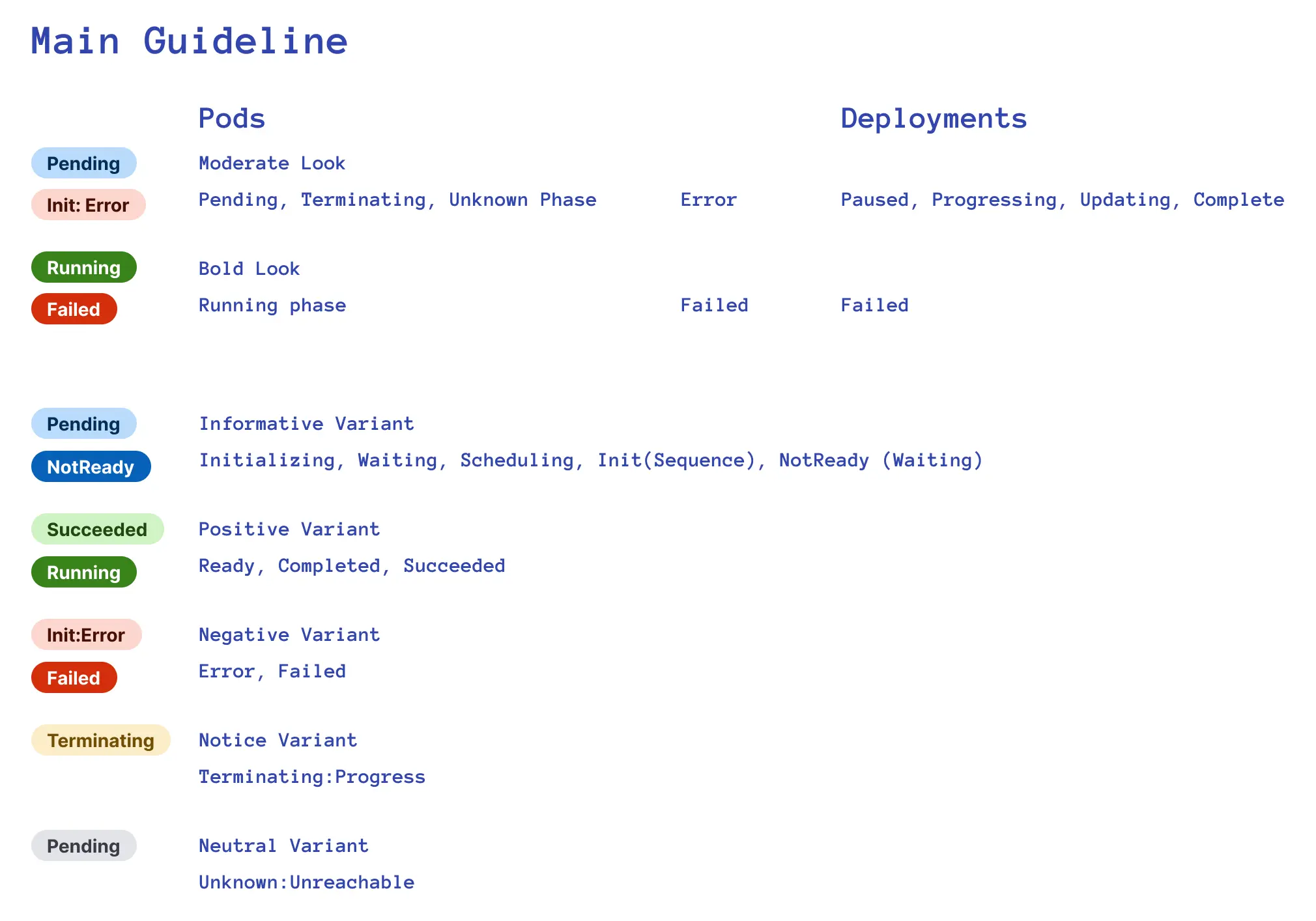
A shared visual language
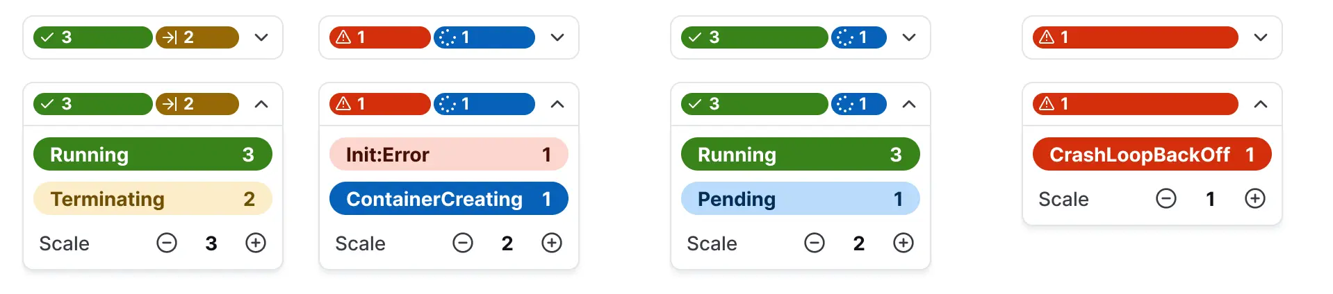
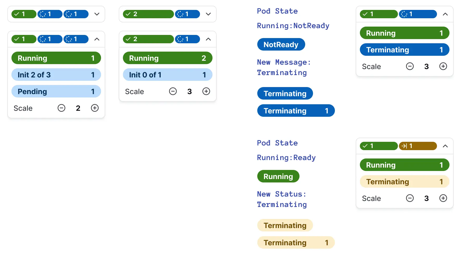
The guidelines map technical conditions to semantic variants and visual treatments. They help keep states such as Pending, Running, Succeeded, Failed, and Terminating recognizable while preserving distinctions between workload types.
Summary and detail in one component
The component explorations show how compact state summaries can expand to reveal individual conditions and counts. This gives users an overview while keeping specific states accessible.
Applied in the product
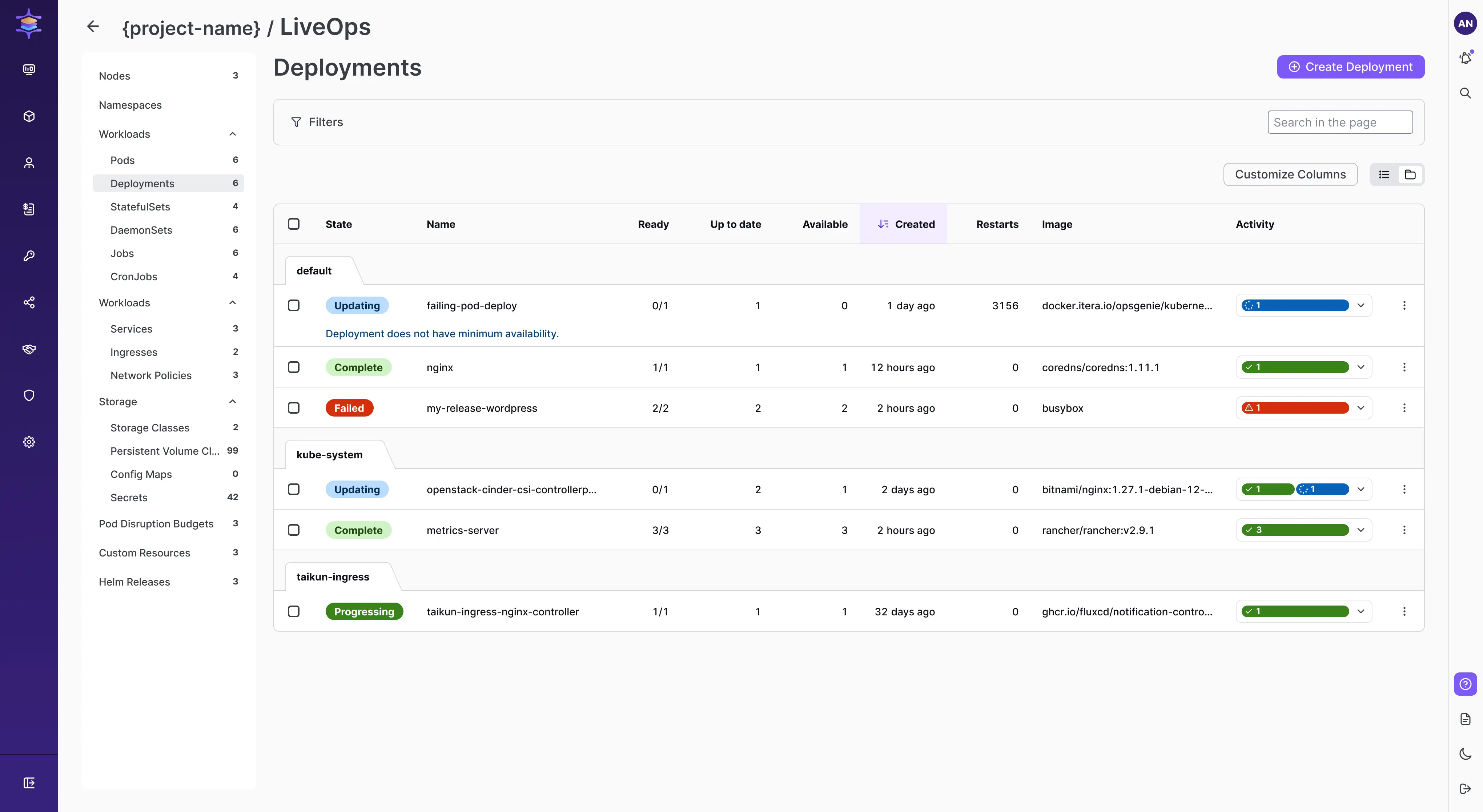
The LiveOps Deployments view places state indicators alongside resource details and activity, so users can scan conditions in the context of their work.
Collaboration and outcome
My role evolved alongside the team. I initially contributed to front-end implementation, while a dedicated UI developer later took responsibility for component architecture and implementation. I continued focusing on UX, behavior, consistency, and the design system.
The Project Detail redesign and workload status designs were implemented, contributing to reusable patterns across the product.